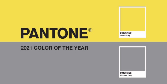
Ultimate Gray is the color of cloudy skies, sidewalk cement, and comfortable bed linens. Being neutral emotionally and physically, it’s emblematic of ambiguity, composure, and irresolution. In fact, this is the first time an achromatic shade (gray) has been selected.
During quarantine, people have had to look for joy in different ways than we were used to before. As the vaccine roll-out is finally creating hope to an end, Illuminating expresses the sun rising over a dark landscape, a flower sprouting in an abandoned parking lot, and the light at the end of the tunnel.
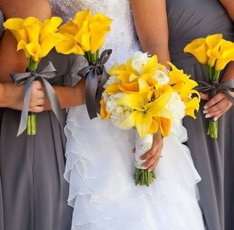
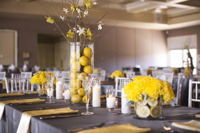
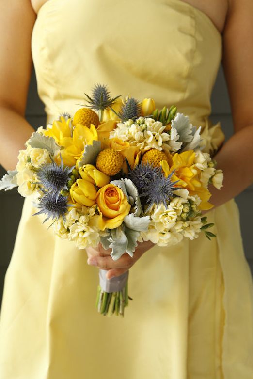
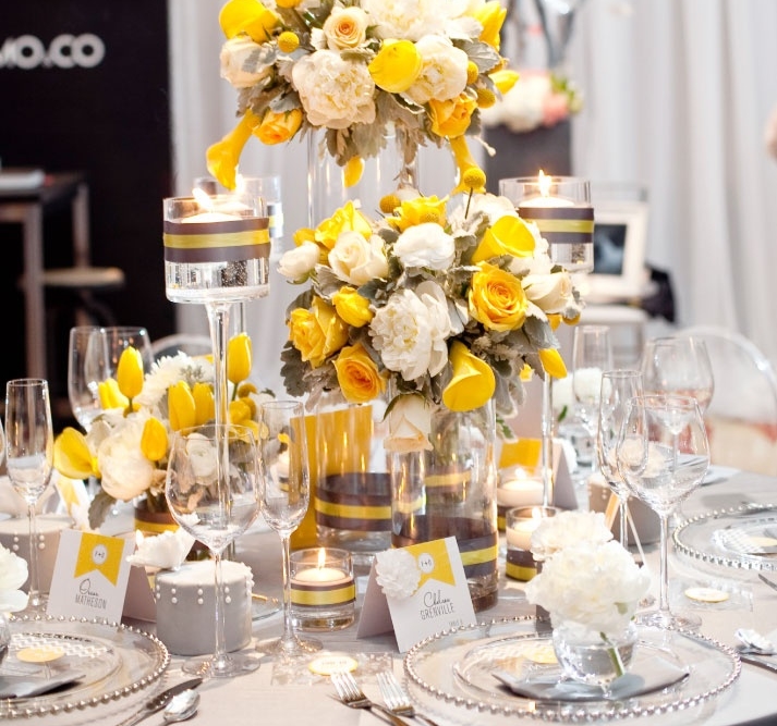
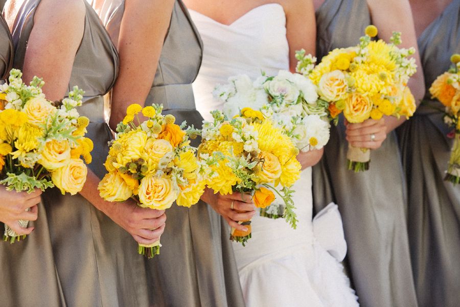
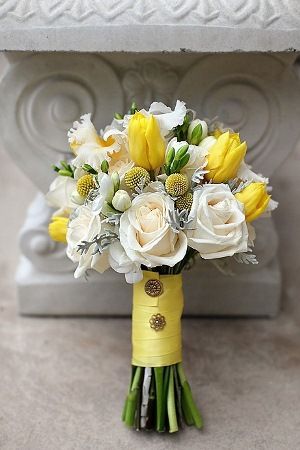
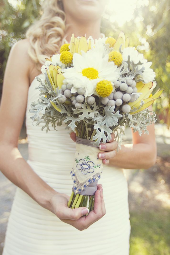
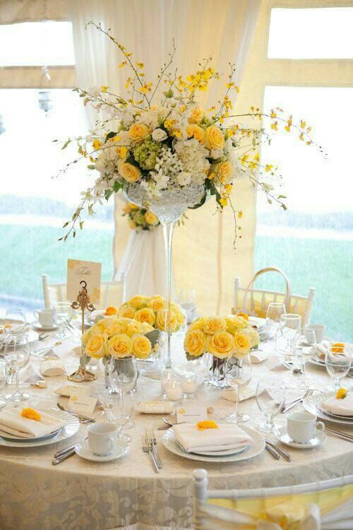
The contrasting color combination of Illuminating and Ultimate Gray provide a peaceful- yet-happy, conservative-yet-playful palette for event and floral design. The vibe set with these two colors is contemporary, classic and bright. The mood within the design becomes bliss and comfort combined. We can choose flowers in yellow, combined with silvery leaved accents, and round out the Ultimate Gray with non-floral design elements .. linens, containers and ribbon.
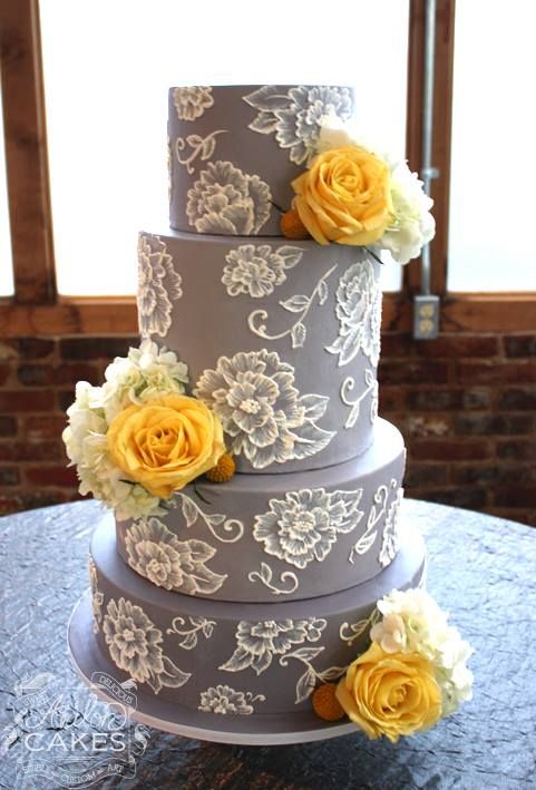
In Keepsake design, the combination becomes achieved within the actual preserved flowers alone, but also with yellow and golden-toned flowers paired with silver and gray keepsake design elements. Clients can choose silver shadowbox moulding or silver cube or dome base finishes, or our pewter and smoke background fabric linings and graphite-toned matboard border treatment to complement their yellow and silvery blooms. Its so much fun to see these color combinations happen organically, just because the color combination brings visual pleasure to our clients who’ve chosen these colors. And once done? Voila! The 2021 Colors or the Year achieved accidentally! Ahhhh!
The contradicting color combination was used in Maurizio Cattelan’s sculpture of a banana stuck on the wall by a piece of duct tape, which deputed at Art Basel Miami Beach 2019…ironically just before the pandemic breakout. And the subject matter of this sculpture, ironically illustrates the absolute uniqueness and unexpectedness of what the pandemic was about to bring.
In floral and event design, we can enjoy this dichotomous color combination with some of our favorite sunny yellow flowers blended with some lesser-used greenery elements, like dusty miller, silver brunia berries or other silvery-leaved flowers and plants. Yellow roses are an instant go-to, but gerbers, callas or other yellow-tinted flowers can achieve the Illumiating color tone and add that punch of hope we’re all looking for this year.

Pantone creatively chose colors that represent the somberness we’ve all been experiencing, and the importance of finding things that shine light in our lives amongst the chaos. “You can’t get away from the overwhelming influence of the pandemic.” Said Laurie Pressman, Vice President of the Pantone Color Institute. “Two extremely independent colors highlight how different elements come together to express this message of strength and hopefulness.”